Currently creating professional grade investment tools for the individual investor at
For inquiries: chrisarnoldchris@gmail.com
Recent Projects
Due Diligence Widget
Final Product
Ideas
Role: Lead Designer
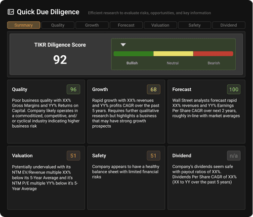
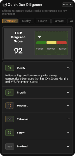
At TIKR we are aiming to create investment products that empower the average person to find investment ideas. One of the main challenges for young investors is to understand where to even start when analyzing a company's investment potential. The Quick Due Diligence widget is designed as a powerful tool that:
creates a score based on key financial health metrics to guide both new and seasoned investors
a gateway into the product at large that could function as a 'guide' of sorts to get investors headed in the right track.
We explored a number of ideas to create something useful and visually appealing that could potentially be integrated into a user’s research flow. A quick glance at the score would give you an overview of the company’s value in the longer term based on a few key metric scores. Within each of those scores are 5 important line items to note about that particular metric. Clicking on the hyperlinks within the metrics lead you to that particular line item in the financials section of the app.
TIKR has originally appealed to more sophisticated investors and the creation of this this feature functions as the first step of the company's evolution into a product that less experienced investors can get into more while still providing immediate value to more sophisticated investors
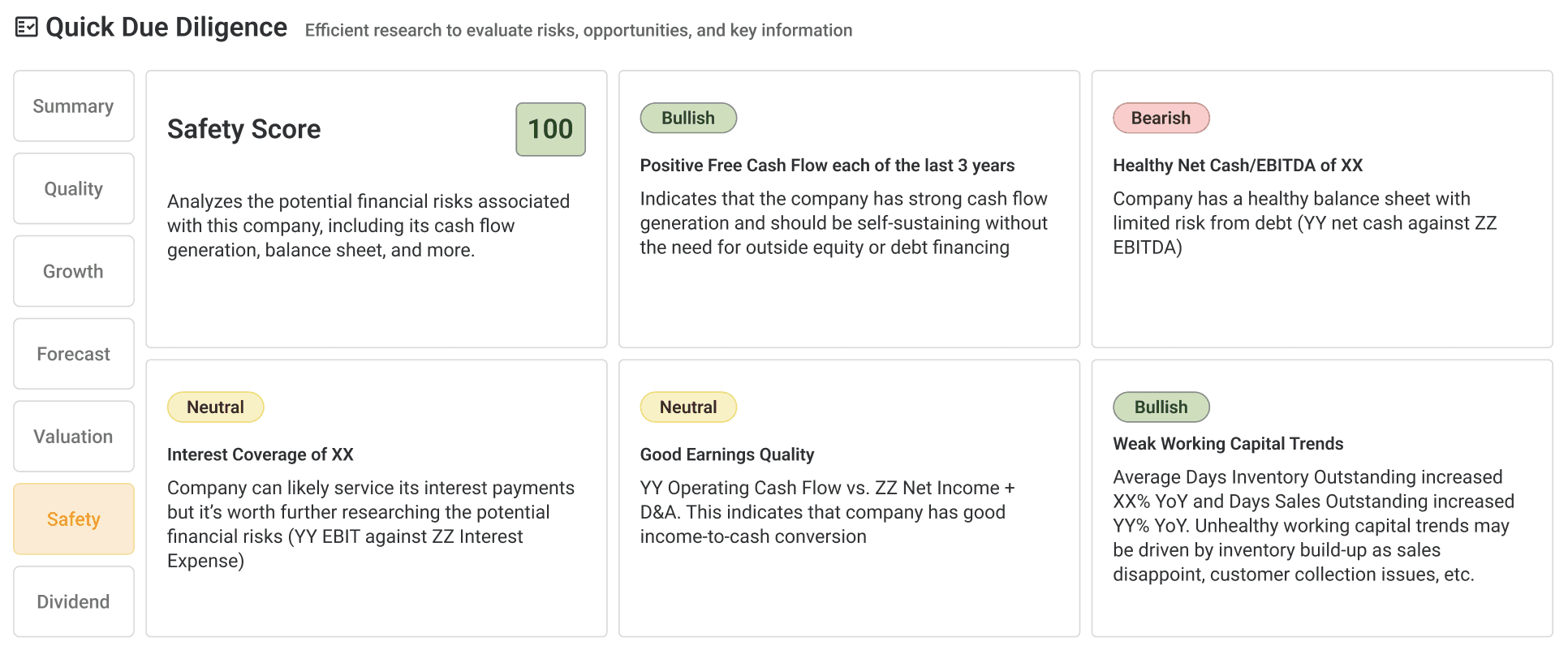
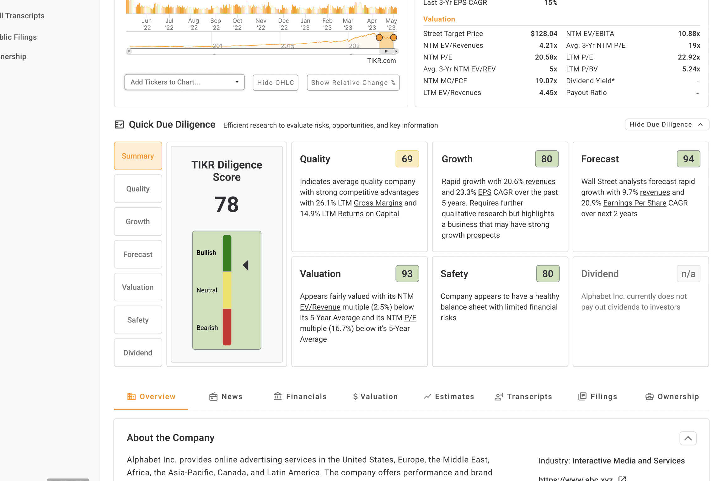
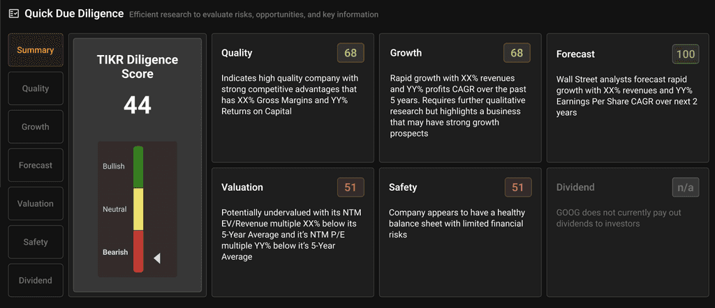
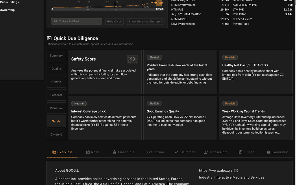
The most difficult part was trying to fit in a large amount of data into a relatively confined set of space. I think we were successful in our first version of this product feature and will continue to monitor user feedback to make any appropriate improvements.
Dark mode
App Redesign
Role: Lead Designer
In addition to working on new product features, I am also working to redesign the whole app. My aim in this redesign is to evolve the company's design language while still staying true to the original DNA of the product. The company was able to garner an initial user base with product market fit. In respecting this fact, I opted to move the company gradually into a new form rather than a radical shift in the UI to keep current users satisfied and to maintain the core functionality of the product that people have grown to love.
There are still many more ideas in store - this is the just the first wave of changes to be made to evolve the design language of the company and to create a stronger and more sticky product for new and seasoned investors. I wanted to create a stronger visual hierarchy and to start to develop the character of the company. Approachable but assertive, functional, and clear.
The market overview page, the first one you see when you open the app
The watchlist feature to track stocks via a number of selected metrics. I created a stronger visual hierarchy and reduced the text present to reduce cognitive load.
I am also working to update the company's marketing site content to track user engagement and look for performant solutions.

More projects and portfolio updates to come…